Work
Information Architecture / User Research / Wireframe / Design System / UI Design / Testing
Timeline
August 2020 – Present
Tools
Figma
Create a feature-rich, user-friendly app for the Chinese community in Canada
Team
This freelance project positioned me as the sole designer, collaborating directly with my client (who is also the primary stakeholder) and a development team based in China.
Background
The majority of Chinese media outlets and publishers in Canada still rely on print newspapers and magazines. While a few Chinese news mobile apps exist, most suffer from poor user experience design.
My client envisioned an app that would serve the Canadian Chinese community by providing access to high-quality articles and content, alongside practical resources such as local business reviews, school rankings, job postings, coupons, and discount offers.
Challenges
Feature complexity: How do you design a multi-featured app that remains intuitive and easy to navigate? How can users quickly find what they need without feeling overwhelmed?
Tight timeline: The client aimed for a Spring 2021 launch, creating significant time pressure for a project of this scope.
CMS architecture: Designing a content management system that delivers an excellent user experience for both administrators and contributors presented another major hurdle. How do you structure a platform that’s both powerful and approachable?
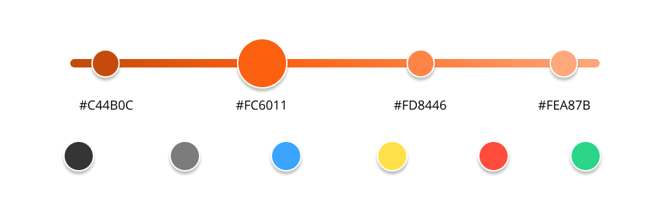
Colour
Chinese apps typically feature vibrant, energetic visuals. Orange is particularly favored in Chinese design—it conveys energy and friendliness while being less aggressive than red and less intense than yellow.
I incorporated orange as the primary color and added complementary hues to help users distinguish between different features and sections.
Typography
I chose Noto Sans for its familiarity—it’s one of the most widely used fonts in Chinese typography, making it comfortable and easy to read for Chinese users.

Components
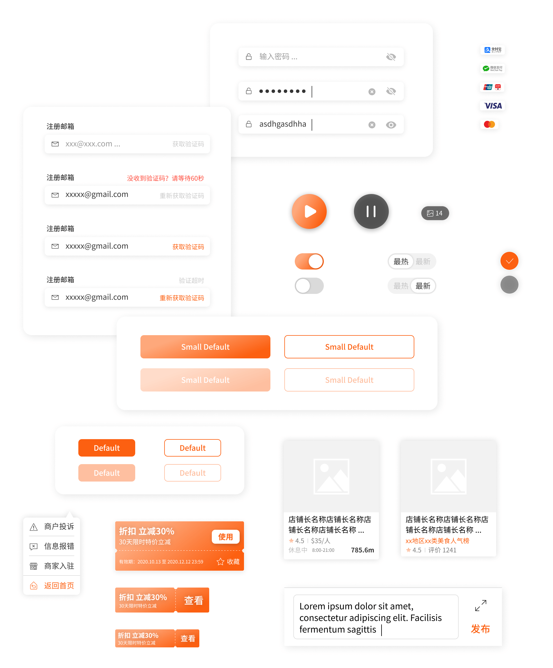
Vectors

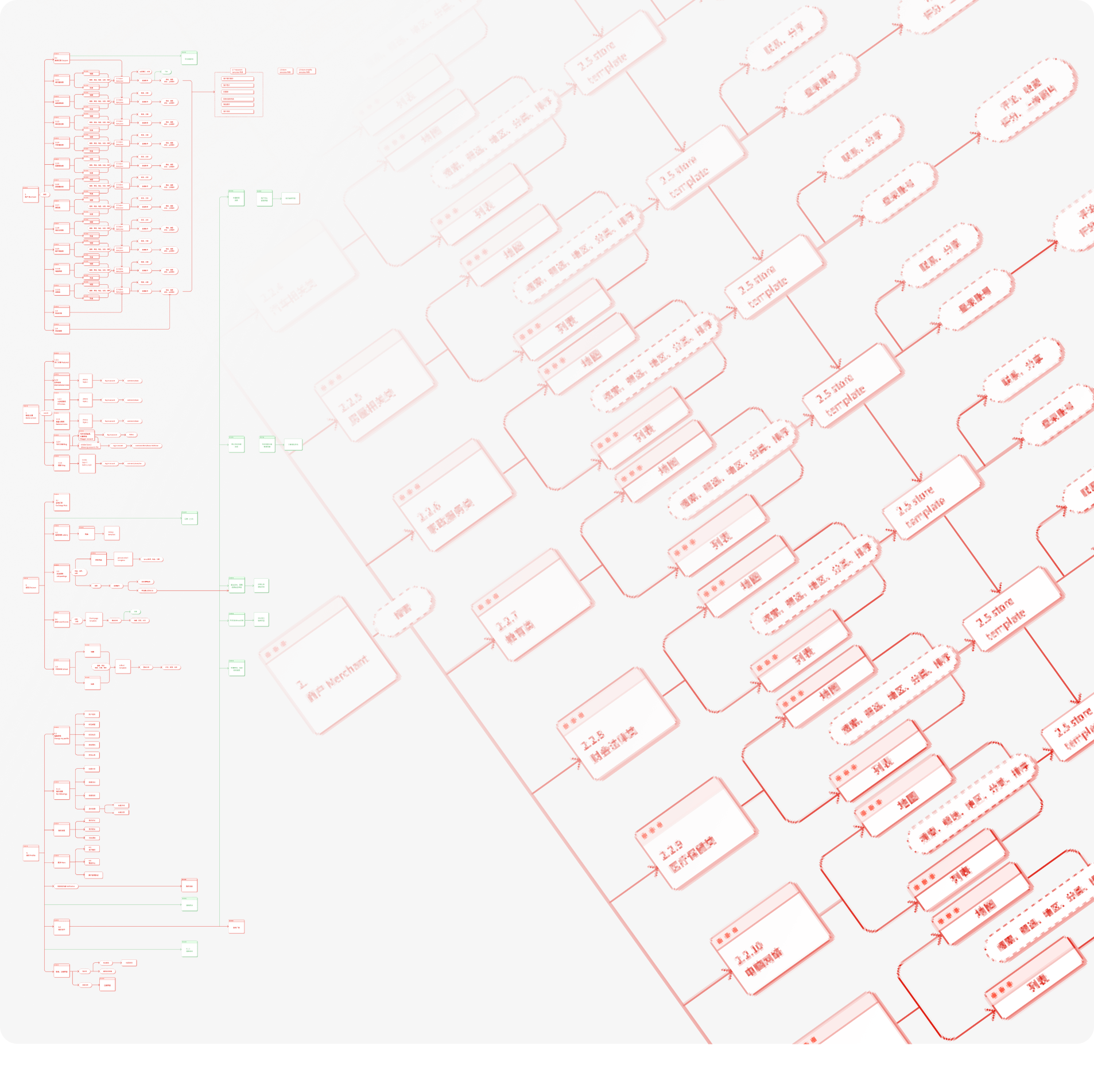
Information Architecture
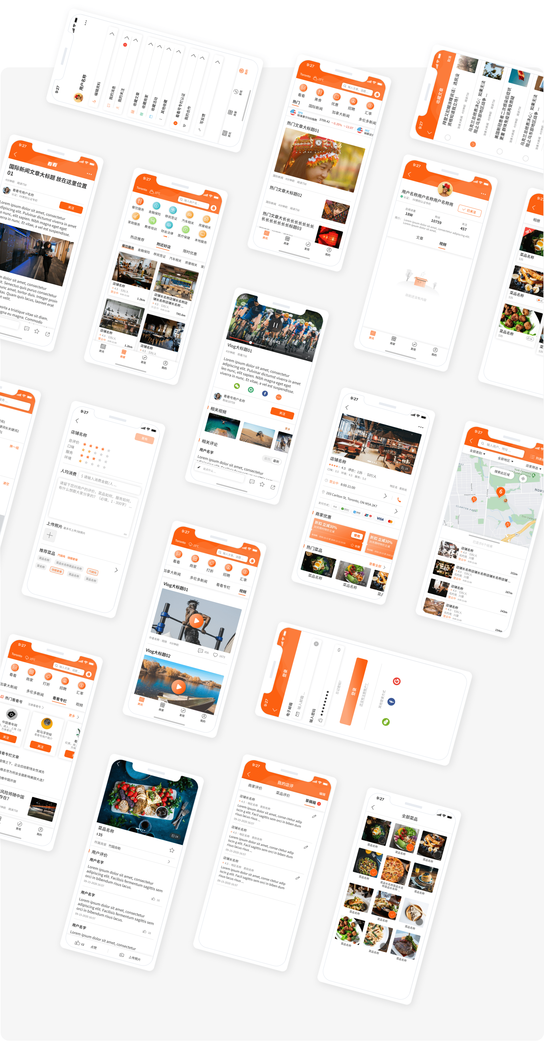
The Kankan app is built around three core features: Articles, Stores, and Discover.
Articles aggregates content from reputable local media outlets, content creators, and independent authors. Stores functions similarly to Yelp, providing business information, user reviews, and coupons. Discover serves as a hub for practical resources including upcoming events, job listings, school rankings, and utility tools like mortgage calculators, gas prices, lottery results, and public transit information.
Each feature involves complex details and numerous user interactions. The challenge was to streamline the user flow across these diverse functions while developing a robust backend platform—all within tight time and budget constraints.
Wireframe
To simplify the user experience and reduce complexity, I focused on including only essential features in each section for Phase 1. All features were designed to operate independently, avoiding cross-feature interactions that could complicate the experience.
Beyond design work, I invested significant time in stakeholder communication to clarify requirements for both the current phase and future roadmap. I also collaborated closely with the development team to establish a backend structure that would meet stakeholder needs while supporting scalability.
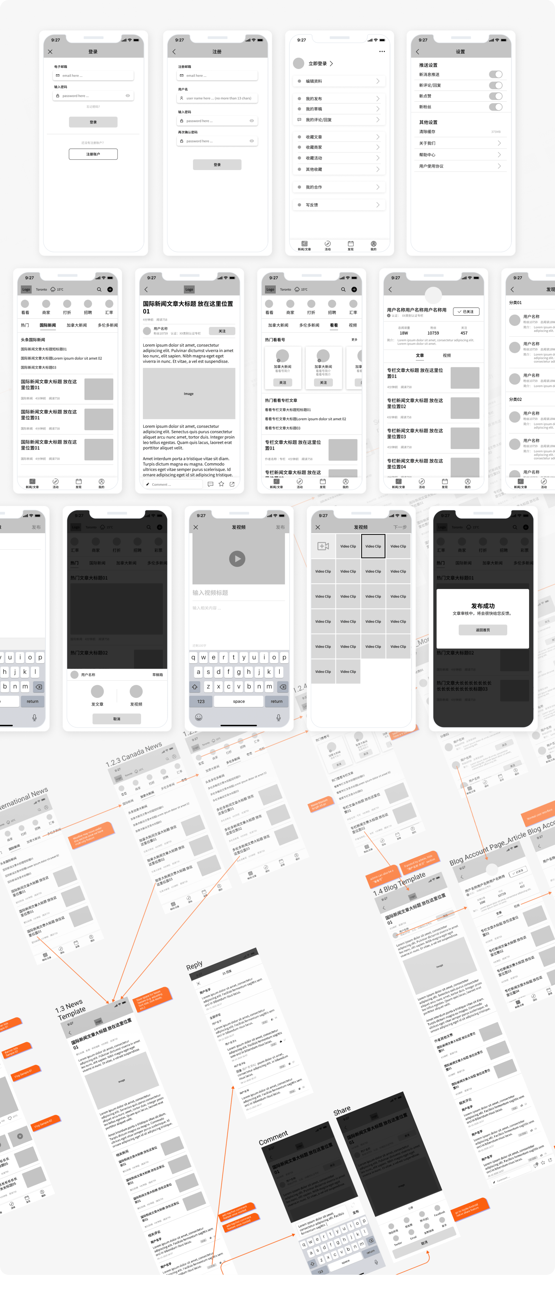
UI Layouts
500+ hours / 200+ screens
Ver 1.0 is planning to released in the spring of 2021.
The App can be downloaded below: